Business Card — Local Business Identity

2020 · Branding · Print Design

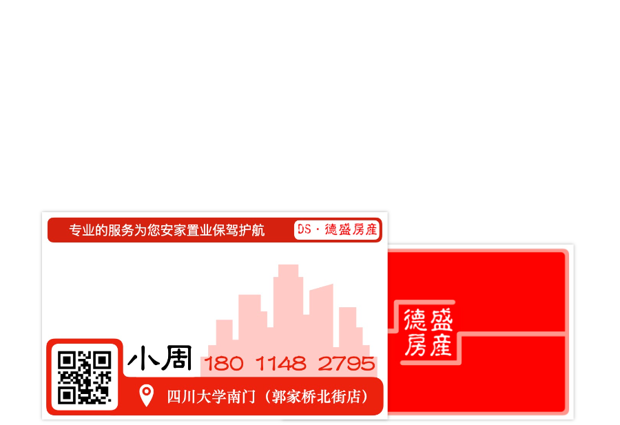
Designed a business card system for a local real estate agency in Chengdu, China. The project balanced clear information hierarchy with visual branding, resulting in a design that has remained in commercial use for several years.

Printed business card design materials

Context

The client was a local real estate agency located near Sichuan University, where most customers were university students searching for rental accommodation.

The business card needed to communicate trust and professionalism while remaining highly practical. Besides contact details, it also needed to include a QR code linking to the company's WeChat account, which served as the primary communication channel.

My Role

Working directly with the business owner, I was responsible for:

• Understanding business requirements and customer needs

• Designing multiple visual directions

• Developing the brand identity

• Refining typography, colour, and layout through client feedback

• Delivering print-ready artwork

Printed business card front and back
Printed business card front.

Design Goals

Rather than treating the card as simply contact information, I designed it as a small extension of the company's identity.

The design was guided by four principles:

Trust - Create a professional first impression for prospective tenants.

Clarity - Prioritise essential contact information while supporting QR-based communication.

Recognition - Develop a memorable visual identity that stood out from competitors.

Cultural Relevance - Blend contemporary graphic design with traditional Chinese visual elements to better reflect the local audience.

Printed business card front and back

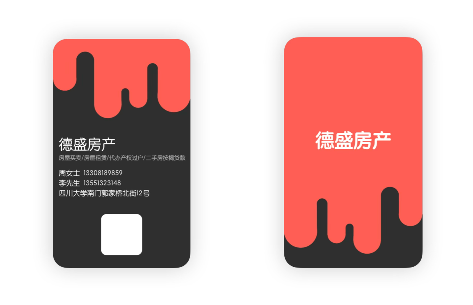
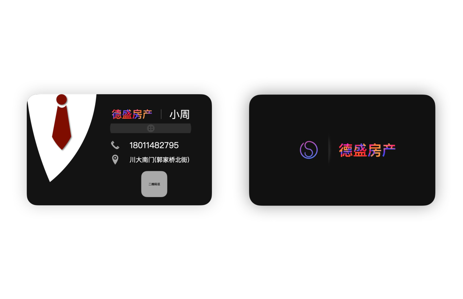
Exploring a Younger Brand

Early concepts experimented with rounded shapes, bright colours, and playful layouts to appeal to the agency's student-focused customer base. While visually distinctive, the direction lacked the credibility expected from a property business.

Early exploration using rounded forms and bold colour blocking to create a youthful visual identity.
Early exploration using rounded forms and bold colour blocking to create a youthful visual identity. Early exploration using rounded forms and bold colour blocking to create a youthful visual identity.

Moving Towards Brand Identity

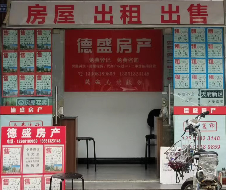
After reviewing the client's existing storefront and marketing materials, I shifted the design towards stronger visual consistency. Red became the dominant accent colour, matching the company's physical branding and increasing recognition across touchpoints.

Image showing storefront
The company's existing storefront established red as the dominant brand colour, influencing the overall visual direction.

Introducing Cultural Elements

To further strengthen the identity, I explored incorporating traditional Chinese design language through seal-inspired graphics and calligraphic typography. These additions reinforced trust while creating a distinctive brand personality.

Image showing seal
Traditional Chinese seal-inspired graphics introduced a stronger sense of identity while reflecting the company's local context.

Final Design

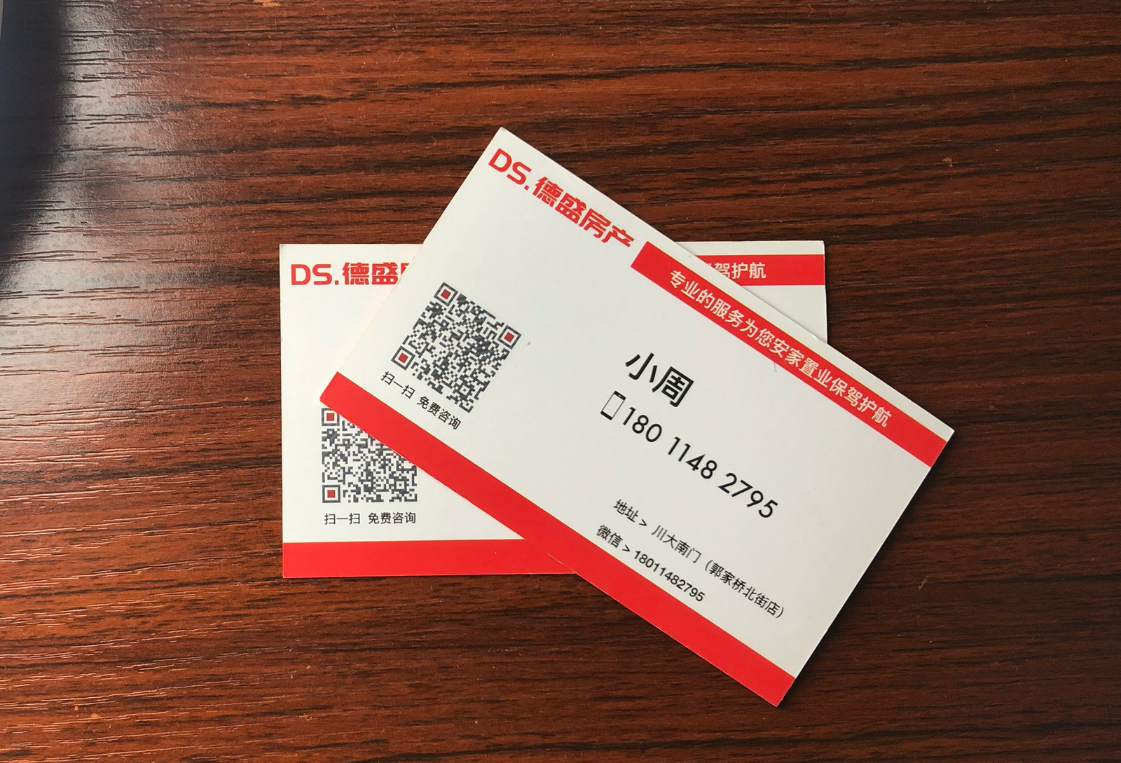
The final design simplified the visual composition by removing unnecessary decorative elements and refining the typography. This created a cleaner layout while preserving the cultural identity established during exploration.

The result balanced professionalism with approachability and has remained in commercial use by the business for several years.

Image of final card
The final design balances readability, brand recognition, and cultural identity while supporting everyday business use.

Reflection

This project taught me that successful branding is not simply about creating visually appealing graphics. Every design decision must reflect the client's business, audience, and existing identity.

It also gave me my first experience working with a real client, translating business requirements into a practical design solution through multiple rounds of feedback and refinement.