Shanghai — An Editorial Travel Experience

2023 · UX/UI Design · Editorial Web Experience

A concept website exploring how bold typography, immersive imagery, and editorial layouts can communicate the personality of a city while inspiring people to discover it.

About Shanghai page from Shanghai Destination Website running on a Mac in Safari.

Context

Rather than designing another tourism website focused purely on information, I wanted to explore how a destination could be experienced visually before users even arrived.

The project reimagines Shanghai as a digital editorial experience where large photography, expressive typography, and carefully structured layouts communicate the city's identity alongside practical travel content.

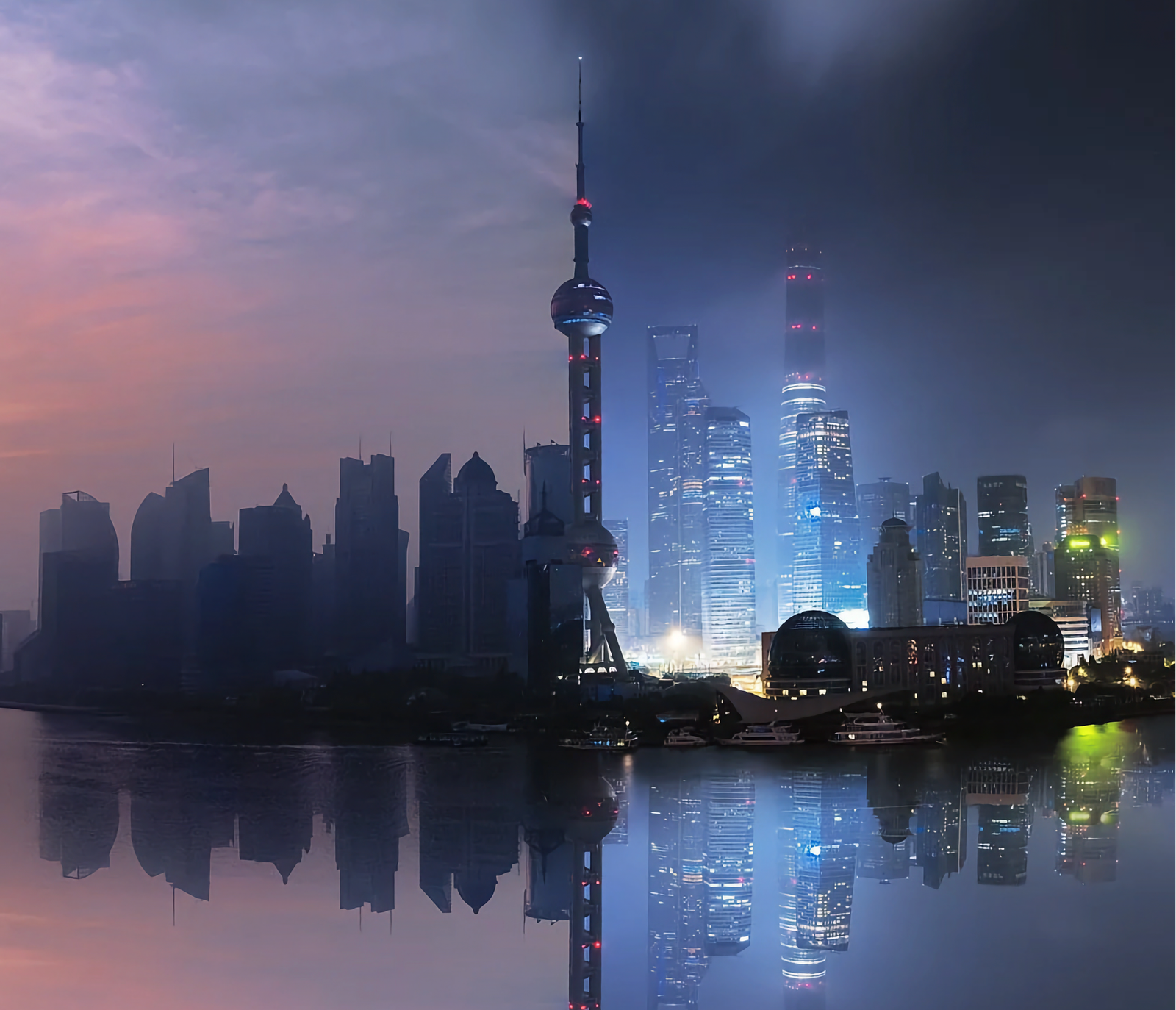
Shanghai's iconic skyline inspired the visual direction of the project, serving as a symbol of the city's energy, scale, and modern identity.

My Role

As the sole designer I was responsible for:

• User research

• Information architecture

• Wireframing

• UI design

• Responsive layouts

• Visual identity

• Prototyping

Design Vision

Instead of asking,

"How can people find attractions?"

I asked,

"How can the interface make people feel the energy and personality of Shanghai?"

This shifted the project beyond functional navigation and towards visual storytelling.

Every page was designed to balance practical travel information with moments that celebrate the city's scale, culture, and modern identity.

Large-scale typography and expansive imagery were used to create an editorial visual language inspired by modern travel publications rather than traditional tourism websites.

Designing a City's Identity

One of my favourite explorations was treating Shanghai itself as the hero of the interface.

Rather than presenting information inside conventional content blocks, I experimented with oversized typography, generous spacing, and the city's skyline to create an editorial composition.

The skyline remains visually anchored while content scrolls through it, allowing buildings to intersect with typography and making the city itself become part of the reading experience. This interaction transforms what could have been a static information page into a memorable visual moment.

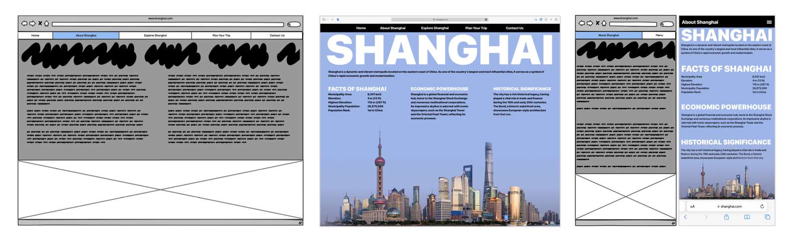
Early wireframes established the overall structure before evolving into an editorial layout that balances large typography, concise information, and panoramic city imagery.
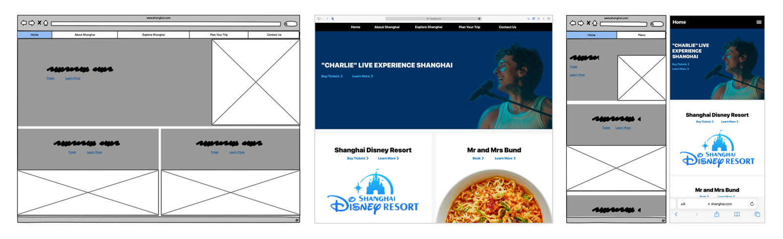
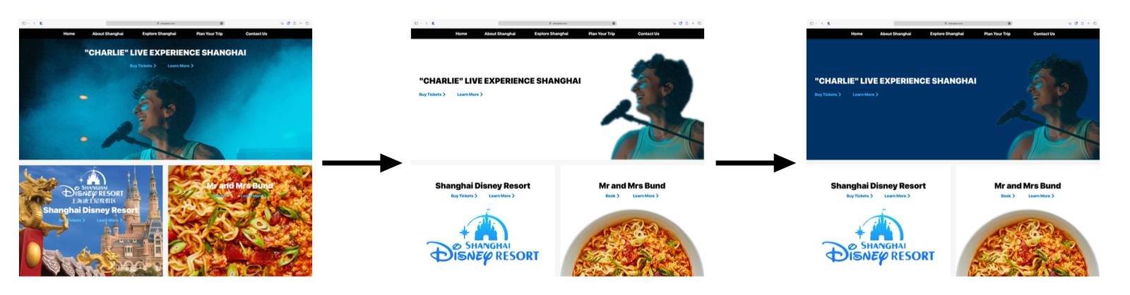
The homepage evolved from a conventional promotional layout into a visually immersive landing page designed to showcase Shanghai through bold imagery and curated content.
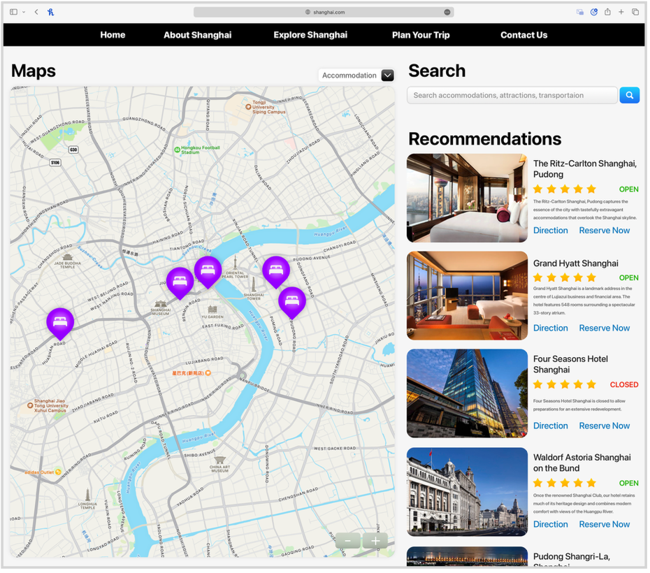
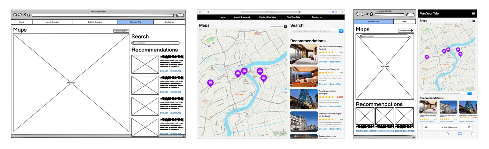
The trip planning experience evolved from low-fidelity wireframes into responsive desktop and mobile interfaces, integrating interactive maps, search, and personalised recommendations within a cohesive layout.
Early wireframes established the overall structure before evolving into an editorial layout that balances large typography, concise information, and panoramic city imagery. The homepage evolved from a conventional promotional layout into a visually immersive landing page designed to showcase Shanghai through bold imagery and curated content. The trip planning experience evolved from low-fidelity wireframes into responsive desktop and mobile interfaces, integrating interactive maps, search, and personalised recommendations within a cohesive layout.

Visual Hierarchy

Throughout the website I focused on making large amounts of travel information feel approachable.

Different layouts were created for inspirational content, destination guides, and planning tools, using:

• oversized headings

• clear content groupings

• generous white space

• strong image-first layouts

• consistent visual rhythm

Rather than relying on decorative graphics, hierarchy is established through typography, spacing, and photography.

Typography, spacing, and alignment were refined to improve readability while giving visual priority to destinations and primary actions.
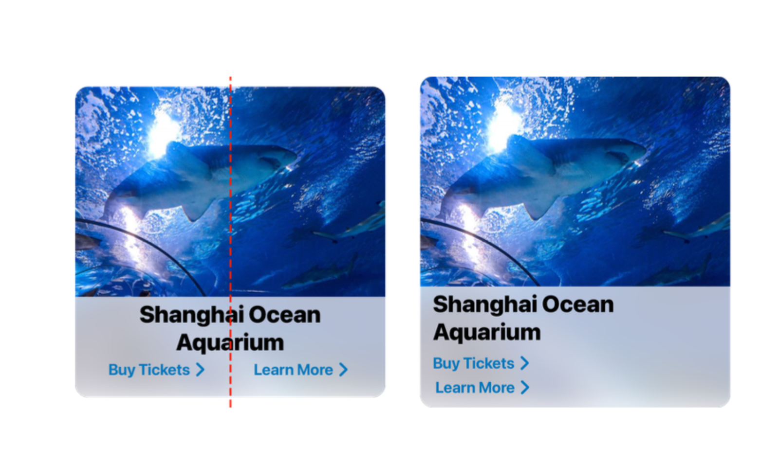
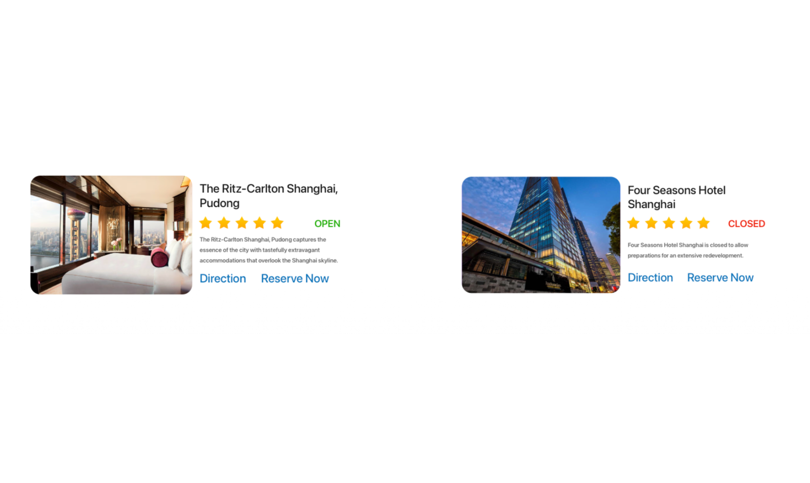
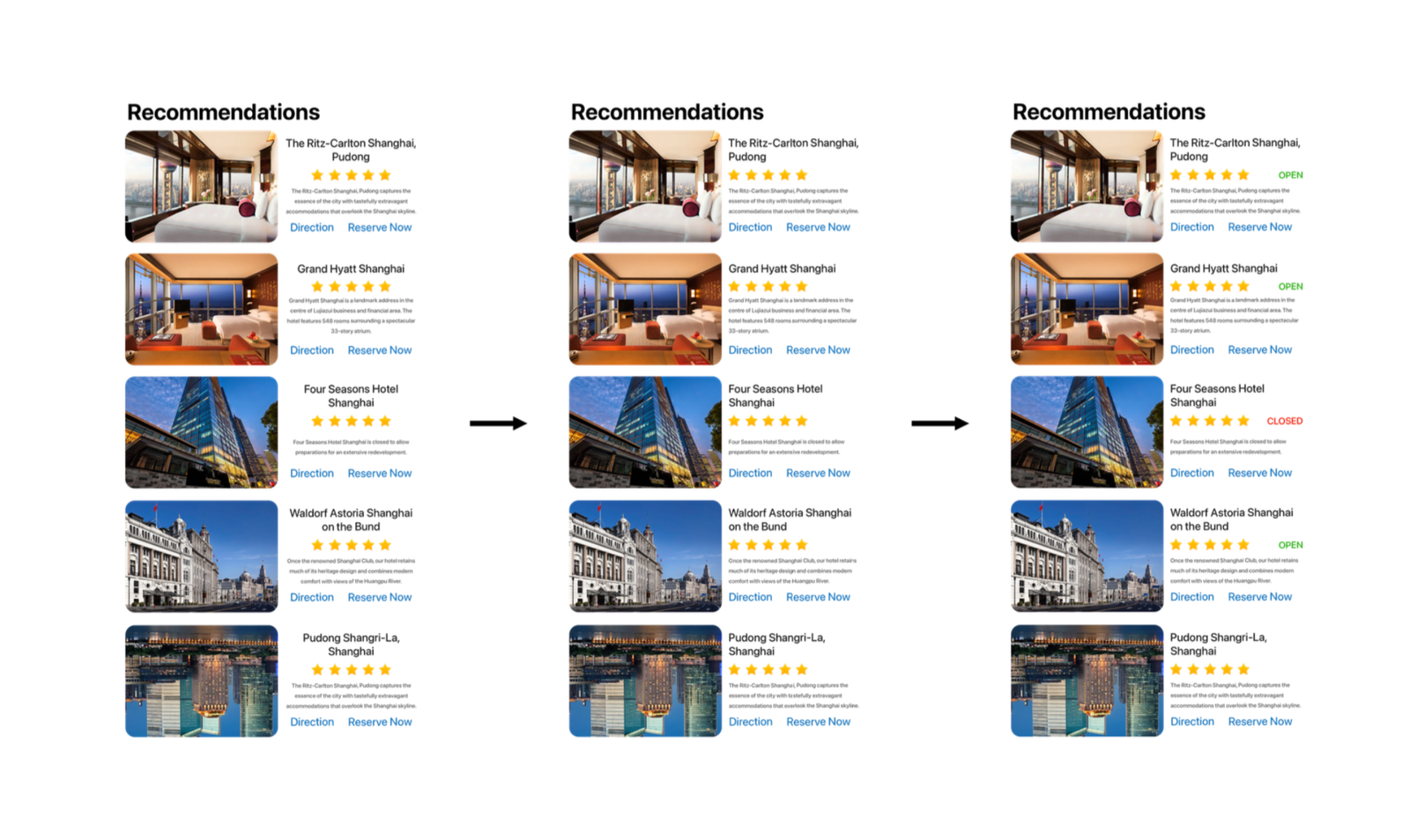
Recommendation cards evolved through several iterations, improving information hierarchy while introducing operational status to help users make quicker decisions.
Progressive refinement simplified recommendation cards, making ratings, descriptions, and actions easier to scan while preserving a consistent visual structure.
Typography, spacing, and alignment were refined to improve readability while giving visual priority to destinations and primary actions. Recommendation cards evolved through several iterations, improving information hierarchy while introducing operational status to help users make quicker decisions. Progressive refinement simplified recommendation cards, making ratings, descriptions, and actions easier to scan while preserving a consistent visual structure.

Editorial Approach

Instead of designing pages as isolated screens, I approached the project more like designing a magazine.

Each section introduces a different aspect of Shanghai through changing visual compositions while maintaining a consistent design language.

Large imagery, modular cards, and alternating layouts keep the experience engaging without overwhelming the user.

Editorial layouts combine maps, search, and curated recommendations into a single experience, encouraging exploration while keeping essential travel information immediately accessible.

Iteration

The project evolved through continuous refinement.

Some of the most significant improvements included:

• simplifying layouts to reduce visual clutter

• improving contrast to make promotional content more legible

• refining card layouts to create stronger visual rhythm

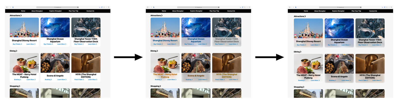
• introducing translucent overlays that allowed photography to remain prominent while improving readability

• improving spacing and alignment throughout the interface

Each iteration focused less on adding elements and more on creating a cleaner, more confident visual language.

Multiple interface iterations refined spacing, typography, and content organisation to improve consistency across the browsing experience.
Repeated visual refinements helped simplify the interface while introducing clearer visual feedback and stronger content hierarchy.
Multiple interface iterations refined spacing, typography, and content organisation to improve consistency across the browsing experience. Repeated visual refinements helped simplify the interface while introducing clearer visual feedback and stronger content hierarchy.

Reflection

Although this project began as a destination website, it became an exploration of how interface design can communicate the identity of a place.

Looking back, the biggest takeaway wasn't learning how to build a website—it was learning how typography, imagery, composition, and interaction work together to tell a story.

That mindset continues to influence how I approach interface design today.